Should backsplash be shiny or matte?

Should backsplash be shiny or matte?

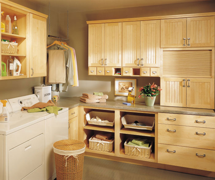
Should backsplash be shiny or matte? When designing or renovating a kitchen or bathroom, one of the key decisions homeowners face is choosing the right backsplash. A crucial factor in this choice is whether to go for a shiny (glossy) or matte finish. Each option has its own set of advantages and considerations, so the best choice depends on your design goals, maintenance preferences, and overall aesthetic.

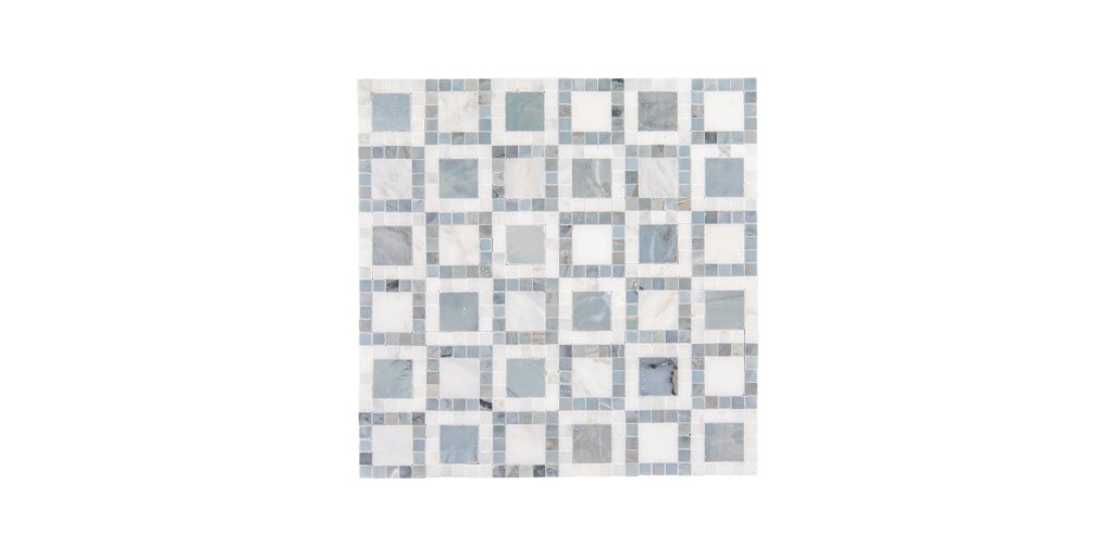
The Case for Shiny (Glossy) Backsplash

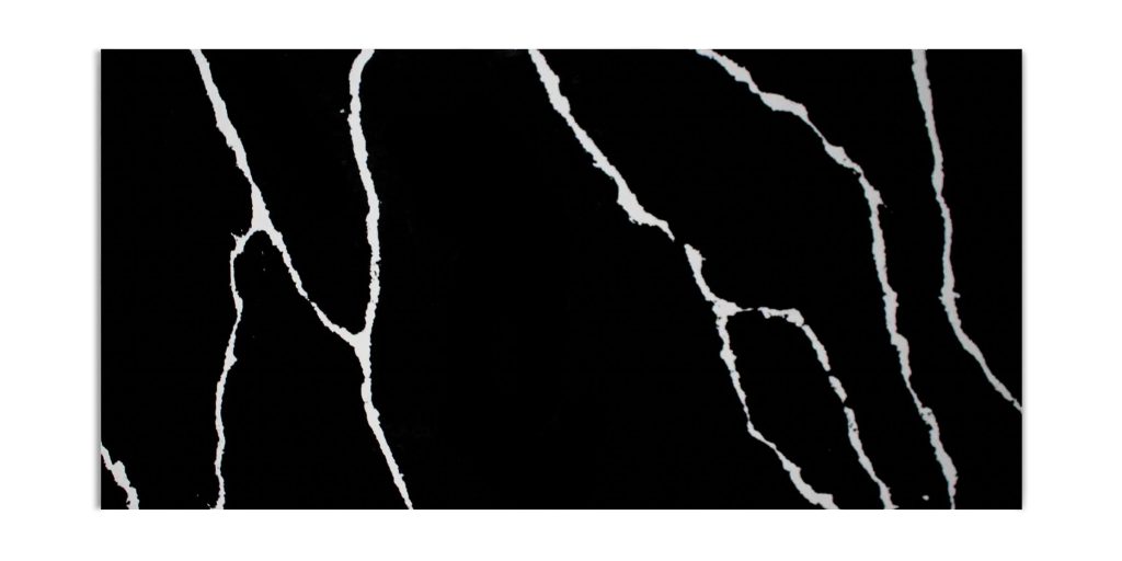
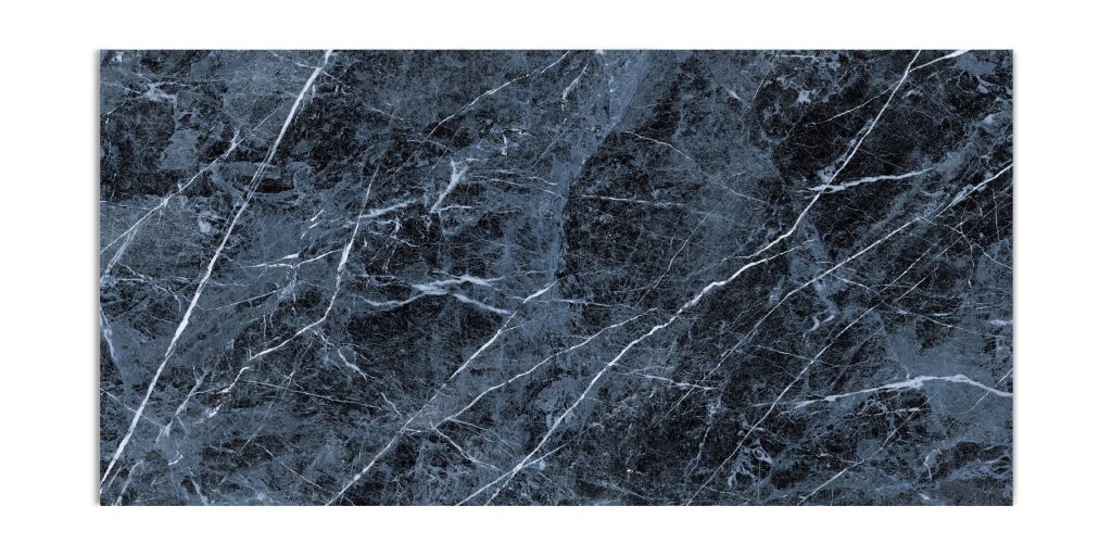
A glossy backsplash is a popular choice for many homeowners due to its reflective surface and polished appearance. Here are some benefits of opting for a shiny backsplash:

  • Enhanced Light Reflection: Glossy tiles reflect light, making a space appear larger and brighter. This is particularly beneficial for small kitchens or areas with limited natural light.

  • Easy to Clean: The smooth, slick surface of a glossy backsplash makes it easier to wipe down and clean. Grease, food splatters, and water stains are less likely to cling to the surface.

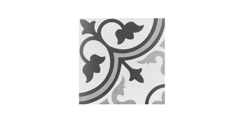
  • Modern and Elegant Look: If you’re aiming for a sleek and contemporary aesthetic, glossy tiles offer a polished and refined appearance.

  • Color Pop: The reflective nature of a shiny backsplash enhances the depth of color, making bold hues stand out even more.

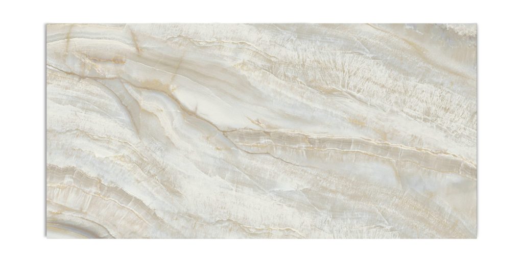
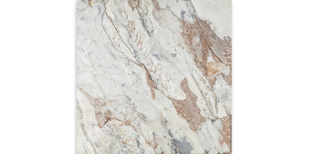
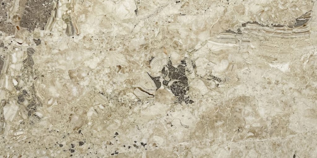
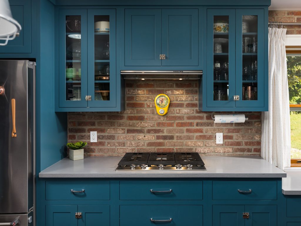
The Case for Matte Backsplash

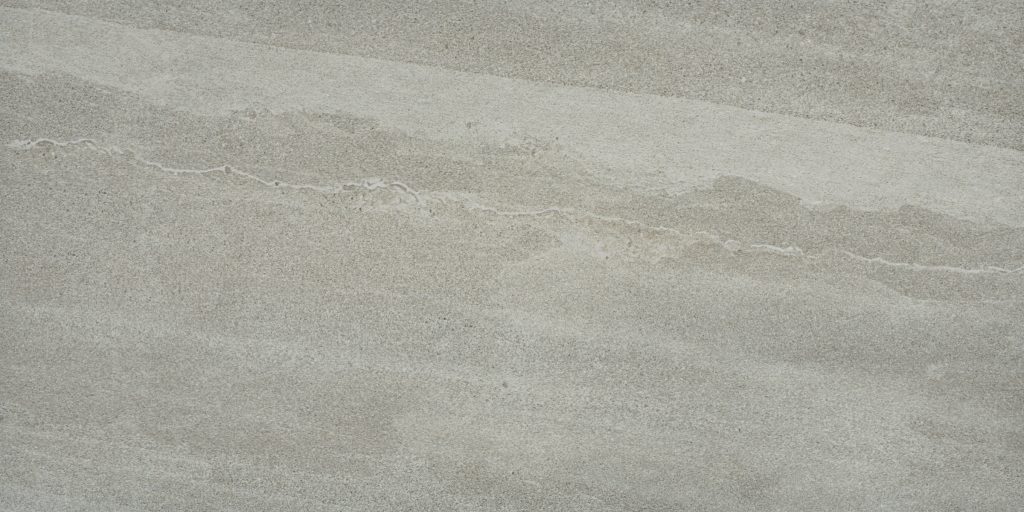
On the other hand, a matte backsplash offers a more subtle, understated look that can be just as stylish. Here are the key advantages of a matte backsplash:

  • Soft and Sophisticated Appeal: Matte tiles create a calm, muted look, which is ideal for rustic, farmhouse, or minimalist designs.

  • Conceals Smudges and Water Spots: Unlike glossy finishes, matte surfaces do not show fingerprints, smudges, or water spots as easily, making them a great choice for high-traffic areas.

  • Textural Interest: Matte finishes provide a sense of depth and texture, adding warmth and character to a kitchen or bathroom space.

  • Less Reflective: If your kitchen already has a lot of shiny surfaces, such as stainless steel appliances or quartz countertops, a matte backsplash can provide a balanced contrast.

Which One is Right for You?

So should backsplash be shiny or matte? The decision between a shiny or matte backsplash ultimately depends on your design vision and practical needs. If you want a bright, easy-to-clean, and modern look, a glossy backsplash might be the right choice. However, if you prefer a muted, low-maintenance, and sophisticated aesthetic, a matte backsplash could be the better option.

For a balanced approach, some homeowners even mix both finishes—using a matte backsplash with glossy accents or vice versa—to create a unique, dynamic space.

What’s your preference—shiny or matte? Let us know in the comments below!

Why is 50% tile pattern not recommended

Why is 50% tile pattern not recommended?

Why is 50% tile pattern not recommended? When it comes to tiling a floor or a wall, the 50% tile pattern, also known as the brick or running bond pattern, is a popular choice due to its classic and timeless appeal. This pattern involves offsetting each row of tiles by half the width of a tile, creating a staggered effect similar to brickwork. However, despite its widespread use, experts often advise against using this pattern, especially with larger tiles. In this blog post, we’ll explore the reasons why the 50% tile pattern is not recommended and what alternatives you might consider.


1. Lippage Issues: Uneven Tile Surfaces

Lippage is the term used to describe the height difference between adjacent tiles. The larger the tile, the more pronounced this issue becomes. Most ceramic and porcelain tiles have a slight bow or curvature due to the manufacturing process. When these slightly curved tiles are offset by 50%, the highest point of one tile meets the lowest point of another, amplifying the unevenness and creating a trip hazard and an unprofessional look. Even a slight variation in height can catch light differently, making the floor look less smooth and finished.


2. Manufacturing Tolerances: Not All Tiles Are Perfect

No tile is perfectly flat. Tile manufacturers have acceptable tolerances for warping or bowing, especially with larger format tiles (12×24 inches and above). The 50% offset pattern exposes these imperfections the most. In fact, many manufacturers explicitly recommend avoiding a 50% offset with tiles longer than 15 inches, suggesting a maximum offset of 33% instead to minimize lippage.


3. Grout Joint Challenges: Wider Joints Needed

To counteract lippage, installers may need to use wider grout joints, which can detract from the sleek, modern look most people want. Wider joints also mean more maintenance and cleaning in the long run. On the other hand, a more uniform pattern allows for tighter grout lines, which look cleaner and require less upkeep.


4. Aesthetic Concerns: Visual Imbalance

The 50% pattern can create a noticeable “step” effect that can dominate the room’s appearance, especially with large or rectangular tiles. The eye is naturally drawn to these staggered lines, which can disrupt the flow of the space. For smaller spaces or areas with lots of light, this pattern can make the floor look busier and less harmonious.


5. Compliance with Industry Standards

The Tile Council of North America (TCNA) recommends avoiding a 50% offset with large-format tiles due to the risk of lippage. Many tile manufacturers follow these guidelines, and ignoring them can void warranties or lead to disputes if issues arise after installation.


Recommended Alternatives to the 50% Pattern

To reduce the risk of lippage and create a more balanced look, consider these alternatives:

  1. 33% Offset Pattern: Shifting tiles by one-third of their length instead of half can significantly minimize lippage while maintaining a staggered appearance.

  2. Grid Pattern: Aligning tiles in a straight grid offers a clean and modern look, eliminating offset-related issues entirely.

  3. Herringbone or Chevron: These patterns distribute potential lippage more evenly and add a dynamic element to the design.

  4. Random Offset: A less structured approach that avoids consistent alignment, reducing the emphasis on any minor lippage that may occur.


Conclusion

So why is 50% tile pattern not recommended? While the 50% tile pattern may seem like a simple and appealing choice, its potential pitfalls make it a less-than-ideal option, especially with larger tiles. Considering alternatives like the 33% offset or grid patterns can help you achieve a flawless, professional finish. By understanding the limitations and recommendations for tile patterns, you can ensure a beautiful and durable installation that stands the test of time.

What is the most popular tile size?

What is the most popular tile size?

What is the most popular tile size? When it comes to choosing tiles for a home or commercial space, size plays a crucial role in both aesthetics and functionality. Whether you’re renovating a bathroom, kitchen, or outdoor patio, selecting the right tile size can make a significant difference in the final look of the space. But what is the most popular tile size? Let’s explore the trending options in the tile industry and discover why people prefer them.

The Most Popular Tile Sizes

1. 12×24 Inches – The Modern Favorite

The 12×24-inch tile is arguably the most popular tile size in recent years. This rectangular format has taken over modern interior designs because of its sleek and contemporary appearance. It’s commonly used for:

  • Flooring: Provides a seamless, expansive look, reducing the number of grout lines.
  • Walls: Ideal for bathroom walls and feature walls in living spaces.
  • Showers: Works well for both shower walls and floors, creating a high-end spa-like feel.

2. 24×48 Inches – Large Format Trend

Large-format tiles like 24×48 inches are gaining popularity, especially in open-concept designs. Also these tiles create a nearly seamless look with fewer grout lines, making the space appear more expansive. They are commonly used for:

  • Living rooms and open floor spaces
  • Luxury bathrooms
  • Feature walls and fireplaces

3. 6×6 & 8×8 Inches – Classic Small Formats

Also for those who love a more traditional or vintage aesthetic, smaller tiles like 6×6 and 8×8 inches remain a staple. These tiles are frequently seen in:

  • Retro and patterned floors
  • Kitchen backsplashes
  • Decorative wall applications

4. 4×4 & 3×6 Inches – Subway Tile Standard

Classic subway tiles, typically 3×6 inches, are a timeless favorite for kitchens and bathrooms. Additionally larger versions, such as 4×4 inches, are also widely used for:

  • Kitchen backsplashes
  • Shower walls
  • Accent walls

5. Hexagonal and Mosaic Tiles

Moreover unique tile shapes like hexagons and mosaics (often in 1×1 or 2×2-inch sizes) remain popular for creating intricate designs. Also these are often used for:

  • Bathroom floors
  • Shower niches
  • Decorative accents

How to Choose the Right Tile Size

Selecting the right tile size depends on several factors, including:

Room Size: Large tiles make small rooms feel bigger, while small tiles can add detail to cozy spaces.
Aesthetic Preference: Modern designs favor larger tiles, while classic and rustic styles often use smaller formats.
Functionality: Also high-traffic areas benefit from fewer grout lines, making larger tiles a practical choice.

Final Thoughts

While 12×24-inch tiles are the most popular choice for modern homes, the best size depends on your specific design goals and space requirements. Whether you prefer large-format tiles for a sleek look or smaller tiles for intricate patterns, the right selection can enhance the overall feel of your home.

What’s your favorite tile size? Let us know in the comments!

Is black quartz a good idea

Is black quartz a good idea?

Is black quartz a good idea? When it comes to selecting the perfect countertop or surface for your home, black quartz is an option that offers both elegance and functionality. But is it the right choice for your space? Let’s explore the pros and cons of this type of quartz to help you make an informed decision.

The Benefits of Black Quartz

1. Aesthetic Appeal

Black quartz exudes sophistication and modern elegance. Whether you prefer a sleek, polished finish or a more subtle matte look, this quartz can add a luxurious touch to any kitchen, bathroom, or commercial space.

2. Durability and Strength

Quartz is one of the hardest minerals on earth, making this quartz surfaces incredibly durable. Unlike natural stones like granite or marble, quartz is engineered, meaning it has enhanced strength and is resistant to chipping, cracking, and scratches.

3. Low Maintenance

Unlike porous materials such as marble, this color of quartz is non-porous, which makes it highly resistant to stains, bacteria, and moisture. This quality means you won’t need to seal it regularly, and everyday cleaning is as simple as wiping it down with mild soap and water.

4. Versatile Design

Black quartz complements a wide range of design styles, from contemporary to industrial and even traditional. Whether you pair it with white cabinetry for a dramatic contrast or with dark tones for a sleek, monochromatic look, black quartz offers endless design possibilities.

5. Heat and Chemical Resistance

Darker quartz can withstand moderate heat and exposure to household chemicals without damage. However, it’s still recommended to use trivets and avoid harsh chemical cleaners to maintain its pristine appearance over time.

Potential Drawbacks of Dark Quartz

1. Visible Dust and Smudges

One downside of this quartz is that it tends to show fingerprints, dust, and water spots more easily compared to lighter surfaces. Regular wiping may be necessary to keep it looking spotless.

2. Potential for Fading

While quartz is UV-resistant, prolonged exposure to direct sunlight can cause some fading over time. If you’re considering black quartz for an outdoor setting or a space with abundant natural light, you may want to explore UV-protected options.

3. Can Feel Too Dark in Certain Spaces

Dark colored quartz can create a bold statement, but in smaller kitchens or dimly lit rooms, it may make the space feel more enclosed. To counteract this, pair it with light-colored cabinetry, backsplashes, or proper lighting to maintain balance.

4. Price Consideration

While quartz is more affordable than high-end marble, premium black quartz varieties can still be costly. However, considering its durability and low maintenance, many homeowners find it a worthwhile investment.

Is Black Quartz the Right Choice for You?

So is black quartz a good idea? If you’re looking for a stylish, durable, and low-maintenance surface, dark quartz is an excellent choice. It offers timeless appeal and practical benefits, making it ideal for modern kitchens, luxurious bathrooms, and commercial spaces. However, be mindful of factors like maintenance, lighting, and placement to ensure it fits seamlessly into your home design.

Would you choose black quartz for your next project? Share your thoughts in the comments below!

What is the hottest trend for countertops

What is the hottest trend for countertops?

What is the hottest trend for countertops? When it comes to high-end kitchen and bathroom design, natural stone countertops continue to dominate the market. This year, designers and homeowners alike are leaning into luxurious, bold, and unique stone selections that make a statement. Here are the top natural stone trends taking over 2024.

1. Quartzite – The Ultimate Marble Alternative

Quartzite has surged in popularity due to its stunning aesthetics and superior durability. Homeowners love its marble-like appearance but appreciate its resistance to scratches, heat, and stains. Taj Mahal, Perla Venata, and Cristallo Diamond are among the most sought-after quartzite slabs, offering elegance with practical benefits.

2. Dramatic Veining & Bold Patterns

Subtle countertops are taking a backseat as statement-making stones gain traction. Marble and quartzite with striking veining—like Calacatta Viola, Amazonite Premium, and Fusion Blue—are in high demand. These materials add movement, depth, and artistic flair to any space.

3. Dark & Moody Tones

While white marble remains timeless, deep, moody hues are making a strong impact. Black, green, and blue stones such as Verde Speranza, Diamond Black, and Aurora Blue bring a sense of luxury and sophistication. These dramatic colors contrast beautifully with lighter cabinetry, creating a rich, modern aesthetic.

4. Leathered & Honed Finishes

Glossy, polished countertops are giving way to textured finishes that offer a more natural and tactile experience. Leathered quartzite, such as Super White Caravaggio Leather and Michelangelo Gold Leather, enhances the stone’s organic beauty while providing a softer, more muted sheen that minimizes fingerprints and water spots.

5. Exotic & Rare Stones

Homeowners are gravitating toward unique, rare, and hard-to-find stones to elevate their interiors. Selections like Sombari Island, Botanic Blue, and Capoloro feature captivating color variations and intricate patterns, turning countertops into works of art. These distinctive stones ensure a one-of-a-kind look that stands out from the ordinary.

6. Earthy & Warm Neutrals

For those seeking a balance between bold and timeless, warm-toned natural stones like Travertino Alabastrino and Taj Mahal Wave are trending. These stones complement natural wood tones and neutral palettes, creating a cozy yet refined aesthetic.

7. Bookmatching for a Seamless Look

Bookmatched slabs are gaining traction as homeowners aim for continuous veining across their countertops, backsplashes, and waterfall islands. This technique, often used with dramatic veined stones like Calacatta Oro Porcelain and Patagonia Mountain, enhances the visual flow and sophistication of the space.

Final Thoughts

So what is the hottest trend for countertops? The hottest countertop trends in 2024 celebrate the beauty and uniqueness of natural stone. Whether you prefer bold and dramatic patterns, dark moody tones, or subtle textured finishes, there's a natural stone to suit every aesthetic. Investing in high-quality quartzite, marble, or granite ensures timeless elegance and lasting durability, making these surfaces a staple in luxury design.

Should bathroom cabinets be lighter or darker than walls

Should bathroom cabinets be lighter or darker than walls?

Should bathroom cabinets be lighter or darker than walls? When designing a bathroom, choosing the right color for your cabinets is more than just a style decision—it’s a strategic one. The relationship between the cabinet color and the walls can dramatically impact the space’s aesthetic, mood, and even perceived size. So, should bathroom cabinets be lighter or darker than the walls? Let’s explore the pros and cons of each option to help you decide.

Lighter Cabinets

Opting for lighter cabinets, such as white, beige, or pastel shades, can create a bright, airy, and open look in your bathroom. Here’s why lighter cabinets might be the right choice for your space:

  • Brightening Small Bathrooms: Light-colored cabinets reflect natural and artificial light, making smaller bathrooms feel more expansive and less cramped.

  • Harmonious Look: If your walls are painted in a light tone, lighter cabinets can blend seamlessly for a cohesive and tranquil aesthetic.

  • Timeless Appeal: Light tones, especially whites and creams, rarely go out of style and can suit both traditional and contemporary designs.

  • Highlighting Textures: Light cabinets can highlight intricate details or finishes like beadboard, shaker-style panels, or textured surfaces.

However, keep in mind that lighter cabinets may require more frequent cleaning, especially in high-traffic bathrooms, as they can show dirt, water spots, and smudges more easily.

Darker Cabinets

Darker cabinets, such as deep gray, navy, black, or rich wood tones, can add depth and sophistication to your bathroom design. Here’s why going darker might work for you:

  • Creating Contrast: Dark cabinets paired with light-colored walls can create a striking contrast, making the cabinets a focal point of the room.

  • Adding Warmth and Drama: Rich, dark tones can bring a sense of coziness and luxury to your bathroom, especially when paired with gold or brass hardware.

  • Hiding Wear and Tear: Darker finishes are excellent at concealing stains, scuffs, or imperfections, making them ideal for busy households.

  • Grounding the Design: Dark cabinets can anchor the room, providing visual balance in larger or more open spaces.

One thing to consider with darker cabinets is that they can make small bathrooms feel more compact. To counteract this, ensure there’s ample lighting and lighter accents to maintain a balanced look.

How to Decide

When deciding whether your bathroom cabinets should be lighter or darker than your walls, consider these key factors:

  1. Bathroom Size: Smaller bathrooms benefit from lighter cabinets to open up the space, while larger bathrooms can handle the richness of darker tones.

  2. Lighting: If your bathroom lacks natural light, lighter cabinets can brighten the room. In contrast, darker cabinets work well in spaces with ample lighting.

  3. Style Preference: For a modern, clean look, lighter cabinets might be the way to go. If you prefer a bold, dramatic design, darker cabinets can deliver.

  4. Wall Color: Think about the existing wall color. If your walls are dark, lighter cabinets can create balance, and vice versa.

  5. Overall Mood: Light cabinets create an airy, fresh feel, while dark cabinets add warmth and sophistication.

Final Thoughts

So should bathroom cabinets be lighter or darker than walls? Ultimately, whether your bathroom cabinets are lighter or darker than your walls comes down to personal preference and the specific needs of your space. By considering factors like size, lighting, and design goals, you can create a bathroom that’s not only functional but also a beautiful reflection of your style. Experiment with samples, explore inspiration boards, and take your time to decide—your dream bathroom awaits!

What is the best type of backsplash behind a stove

What is the best type of backsplash behind a stove?

What is the best type of backsplash behind a stove? The area behind your stove is more than just a wall—it’s a design focal point and a hardworking surface that needs to endure heat, grease, and splashes. Choosing the right backsplash not only enhances your kitchen’s aesthetic but also ensures longevity and ease of maintenance. Here’s a guide to the best types of natural stone materials for the area behind your stove.

1. Porcelain

Why It Works: Porcelain is a man-made material often designed to mimic natural stone, providing the durability and aesthetic appeal needed for a backsplash. It’s heat-resistant, easy to clean, and available in a wide range of finishes and patterns, including ones that replicate marble or granite.

Pros:

  • Resistant to heat and moisture

  • Non-porous and easy to maintain

  • Affordable alternative to natural stone

  • Wide variety of designs and textures

Cons:

  • Can lack the uniqueness of natural stone

Best for: Homeowners who want the look of natural stone with lower maintenance requirements.

2. Marble

Why It Works: Marble backsplashes are synonymous with luxury and elegance. Known for their unique veining and soft, timeless appeal, marble adds a sophisticated touch to any kitchen. While it requires sealing to prevent staining, marble can withstand the heat from a stove when properly maintained.

Pros:

  • Unique, natural patterns and veining

  • Heat-resistant

  • Adds a luxurious aesthetic

Cons:

  • Requires sealing to prevent staining

  • Prone to etching from acidic substances

Best for: Luxury kitchens or spaces aiming for a classic and elegant look.

3. Quartzite

Why It Works: Quartzite is a natural stone that’s harder than marble and almost as durable as granite. It’s highly resistant to heat and scratches, making it an excellent choice for a backsplash behind a stove. Quartzite also comes in stunning colors and patterns, often mimicking marble’s beauty but with added durability.

Pros:

  • Extremely durable and heat-resistant

  • Natural, unique patterns

  • Less porous than marble (requires less frequent sealing)

Cons:

  • More expensive than some other materials

  • Requires sealing to maintain resistance to stains

Best for: High-use kitchens that need both beauty and durability.

4. Granite

Why It Works: Granite is a popular choice for its durability and ability to handle heat. With a variety of colors and patterns, granite backsplashes can add natural charm and a polished look to your kitchen.

Pros:

  • Highly heat-resistant

  • Durable and long-lasting

  • Wide variety of natural patterns

Cons:

  • Requires periodic sealing to prevent stains

Best for: Kitchens that need a balance of style and toughness.

5. Travertine

Why It Works: Travertine is a type of limestone that brings a rustic and earthy vibe to kitchens. With proper sealing, it can handle the demands of a stove’s environment while adding warmth and texture.

Pros:

  • Natural, warm tones

  • Unique texture and appearance

  • Heat-resistant

Cons:

  • Requires sealing to protect against stains

  • More porous than other stones

Best for: Traditional or rustic-style kitchens.

6. Soapstone

Why It Works: Soapstone is a natural stone known for its smooth, matte finish and heat resistance. Its rich, dark appearance adds a modern yet timeless look to your kitchen. Soapstone is non-porous, making it resistant to stains and bacteria.

Pros:

  • Non-porous and low-maintenance

  • Heat-resistant

  • Unique, natural patina develops over time

Cons:

  • Limited color options (mostly dark tones)

  • Softer than other stones, making it prone to scratches

Best for: Modern or farmhouse-style kitchens.

Final Tips for Choosing a Natural Stone Backsplash Behind a Stove

When selecting a natural stone backsplash for the area behind your stove, consider these factors:

  • Durability: Choose a stone that can withstand high temperatures and resist stains.

  • Maintenance: Look for options that match your willingness to seal and maintain the surface.

  • Style: Natural stone offers unique patterns and textures, so find one that complements your kitchen’s aesthetic.

  • Budget: Natural stone can vary significantly in price, so explore options that align with your financial plan.

So what is the best type of backsplash behind a stove? Whether you prefer the elegance of marble, the rugged charm of travertine, or the durability of quartzite, natural stone backsplashes add unmatched beauty and functionality to your kitchen. Choose a material that fits your style and needs, and enjoy the timeless appeal of natural stone in your home!

Is large format tile out of style

Is large format tile out of style?

Is large format tile out of style? When it comes to interior design, trends come and go, but certain styles tend to stay relevant due to their versatility and timeless appeal. Large format tiles have been a popular choice for both residential and commercial spaces for years. However, a common question among homeowners and designers today is whether large format tiles are going out of style.

The short answer? No, large format tiles are not out of style. In fact, they are evolving with trends and continuing to hold a significant place in modern design. Here’s why:

The Appeal of Large Format Tiles

Large format tiles, typically defined as tiles that are 12×24 inches or larger, have been a game-changer in the world of flooring and wall applications. Their popularity stems from several key benefits:

  1. Seamless Look: The larger the tile, the fewer grout lines there are, creating a more cohesive and uninterrupted surface. This can make a space appear larger and more open—a desirable effect in modern design.

  2. Versatility: Large format tiles come in a wide range of materials, including porcelain, ceramic, marble, and quartzite. This variety allows designers to use them in various settings, from sleek, minimalist bathrooms to expansive living rooms and commercial lobbies.

  3. Durability and Maintenance: With fewer grout lines, large format tiles are easier to clean and maintain. This makes them a practical choice for high-traffic areas or spaces that require frequent cleaning.

Adapting to Modern Trends

While the popularity of large format tiles remains strong, they have adapted to suit current design trends:

  • Natural Aesthetics: Many homeowners are gravitating towards materials that mimic natural stone, wood, or concrete. Large format tiles in these designs offer the beauty of organic materials with the durability and low maintenance of tile.

  • Matte and Textured Finishes: Glossy finishes are giving way to matte and textured surfaces, which add depth and character to spaces. Large format tiles in these finishes are particularly trendy for creating modern, understated looks.

  • Unique Layouts and Applications: Designers are experimenting with unconventional layouts, such as vertical installations or combining large tiles with smaller formats for a layered effect. Large format tiles are also being used as statement wall pieces, countertops, and even furniture cladding.

Why Some May Think They’re Out of Style

The perception that large format tiles are out of style likely stems from the rapid evolution of design trends. For instance, bold patterns, smaller mosaics, and retro styles have seen a resurgence. However, this doesn’t mean large format tiles are obsolete. Instead, they are often used in tandem with these trends to balance aesthetics and functionality.

How to Keep Large Format Tiles Fresh

To ensure large format tiles feel contemporary in your space, consider the following tips:

  • Pair Them with Contrasting Elements: Combine large format tiles with smaller patterned tiles or contrasting textures to create visual interest.

  • Focus on Color Trends: Opt for colors that align with current palettes, such as warm neutrals, earthy greens, or deep blues.

  • Incorporate Strategic Lighting: Proper lighting can enhance the texture and finish of large format tiles, making them a standout feature.

Conclusion

So is large format tile out of style? Large format tiles are far from being out of style. Their timeless appeal, adaptability to trends, and practical benefits ensure they remain a staple in modern design. Whether you’re renovating a cozy bathroom or designing a spacious commercial space, large format tiles offer endless possibilities to create a sophisticated and functional environment. Embrace their versatility, and you’ll find they can be a stunning addition to any project.

What is the most commonly used stone tile

What is the most commonly used stone tile?

What is the most commonly used stone tile? When it comes to home design, stone tiles are a timeless choice, offering both durability and natural beauty. Among the many options available, some stones are more commonly used than others due to their availability, versatility, and aesthetic appeal. Let’s explore which stone tiles dominate the market and why they’re so popular.

1. Marble Tiles: The Classic Favorite

Marble is undoubtedly one of the most commonly used stone tiles in both residential and commercial spaces. Known for its luxurious appearance and timeless elegance, marble offers:

  • Variety of Colors and Patterns: From the classic white Carrara to bold Calacatta with its striking veining, marble suits a wide range of styles.
  • Versatility: Ideal for floors, walls, bathrooms, and kitchen backsplashes.
  • Polished Look: Its reflective surface adds brightness and sophistication to any room.

While marble is beautiful, it requires regular maintenance to prevent staining and etching.

2. Granite Tiles: The Durable Workhorse

Granite is another top contender for the most commonly used stone tile, especially in high-traffic areas. Its key features include:

  • High Durability: Resistant to scratches, heat, and stains.
  • Rich Colors and Textures: Available in a variety of shades, from neutral tones to bold, speckled patterns.
  • Low Maintenance: Sealed granite tiles are easy to clean and maintain.

Granite is a preferred choice for kitchen floors and countertops due to its robust nature.

3. Travertine Tiles: The Rustic Charmer

Travertine tiles have been a popular choice for centuries, thanks to their warm, earthy tones and natural textures. Their appeal lies in:

  • Natural Beauty: Subtle variations in color and veining give travertine a unique, organic look.
  • Slip Resistance: Textured finishes make travertine suitable for bathrooms, patios, and pool areas.
  • Affordability: Compared to marble, travertine is often more budget-friendly.

However, travertine is a porous stone, so proper sealing is necessary to maintain its appearance.

4. Slate Tiles: The Contemporary Choice

For a more modern and rugged look, slate tiles are a popular option. Known for their:

  • Unique Texture: Slate’s natural cleft surface adds depth and character.
  • Variety of Colors: Available in shades of gray, green, black, and even rust.
  • Durability: Suitable for both indoor and outdoor use, slate can withstand heavy wear and tear.

Slate is commonly used in kitchens, entryways, and outdoor spaces for a chic and contemporary vibe.

5. Limestone Tiles: The Soft and Subtle Option

Limestone tiles are favored for their soft, neutral tones and understated elegance. They offer:

  • Versatility: Suitable for walls, floors, and fireplaces.
  • Natural Warmth: Creates a cozy and inviting ambiance.
  • Ease of Shaping: Limestone is relatively easy to cut and shape for custom designs.

Like travertine, limestone requires regular sealing to protect its porous surface.

Why These Stones Are Popular

The popularity of these stone tiles stems from their combination of aesthetic appeal, practicality, and availability. Homeowners and designers choose these options because they cater to various tastes, from classic and traditional to modern and minimalist.

Final Thoughts

So what is the most commonly used stone tile? While marble often takes the crown for its widespread use and iconic appeal, other options like granite, travertine, slate, and limestone also hold their ground as common choices in the stone tile market. Your selection ultimately depends on your specific needs, style preferences, and maintenance expectations. Regardless of your choice, stone tiles offer a natural and enduring beauty that enhances any space.

What color compliments blue tile

What color compliments blue tile?

What color compliments blue tile? Blue tiles can create a stunning, serene, or vibrant foundation in any space, from bathrooms to kitchens to outdoor patios. Whether you’re working with light pastel blues or deep navy tones, the right complimentary colors can elevate your design and create a cohesive, harmonious aesthetic. Here’s a guide to choosing the perfect colors to pair with your blue tile.


1. Classic White: Crisp and Timeless

White is a classic choice to pair with blue tile, offering a clean and timeless look. It works particularly well for:

  • Light Blue Tiles: White enhances their airy, beachy feel.
  • Dark Blue Tiles: The contrast makes the space feel sharp and contemporary.

White cabinetry, trim, or walls can balance blue tile while keeping the space feeling open and fresh.


2. Neutral Grays: Elegant and Versatile

Gray tones complement blue beautifully, creating a subtle and sophisticated palette. Depending on the mood you want to achieve:

  • Cool Grays: Enhance the cool tones of blue tiles for a sleek, modern aesthetic.
  • Warm Grays: Add a cozy feel while still maintaining neutrality.

Gray grout or countertops are great options to tie in with blue tiles, particularly in kitchens and bathrooms.


3. Earthy Neutrals: Warm and Grounding

For a natural, grounded look, earthy neutrals like beige, tan, or taupe can soften the vibrancy of blue tiles. These colors:

  • Create warmth and balance.
  • Work particularly well with light blue or turquoise tiles.

Think of sandy beige paired with oceanic blues for a coastal vibe.


4. Complementary Colors: Orange and Terracotta

Orange is directly opposite blue on the color wheel, making it a striking complementary choice. While a bold orange might be too overpowering, consider:

  • Terracotta: A muted, earthy version of orange that adds warmth and texture.
  • Peach or Coral: Soft, pastel tones that add vibrancy without overwhelming.

These colors work wonderfully as accent elements like rugs, throw pillows, or artwork.


5. Green Tones: Fresh and Harmonious

Blue and green are neighbors on the color wheel, creating a naturally harmonious combination. Opt for:

  • Soft Mint or Sage Green: Gentle and calming for light blue tiles.
  • Forest or Emerald Green: Rich and luxurious for darker blues.

Green accents can come through in plants, textiles, or even furniture.


6. Metallic Accents: Sophisticated Shine

Metallics like gold, silver, or brass can elevate blue tiles, especially in kitchens and bathrooms. Choose:

  • Brushed Brass or Gold: Adds warmth and pairs beautifully with darker blue tiles.
  • Chrome or Silver: Keeps the look clean and modern, especially with lighter blues.

Metallic finishes on fixtures or hardware can provide just the right touch of elegance.


7. Deep Browns or Black: Bold and Dramatic

For a dramatic, modern contrast, pair your blue tiles with deep brown or black accents. These darker tones:

  • Ground the space and highlight the vibrancy of blue tiles.
  • Work best in rooms with plenty of natural light to keep the space from feeling too dark.

Tips for Mixing Colors:

  • Start Small: If you’re unsure about bold pairings, start with small accents like cushions, vases, or artwork.
  • Consider Lighting: Natural and artificial lighting can affect how colors appear, so test samples in the room.
  • Use Patterns: Incorporate patterned fabrics or wallpaper to blend colors creatively.

So what color compliments blue tile? Blue tile is versatile and can adapt to a variety of styles, from coastal retreats to modern sanctuaries. With these complementary color ideas, you can create a balanced and visually stunning space that highlights the beauty of your blue tile. Experiment and find the palette that speaks to your personal style!