What is the trend in pavers 2025?
What is the trend in pavers 2025? As we move through 2025, natural stone pavers continue to dominate the outdoor design world, offering timeless elegance with modern functionality. Whether you’re upgrading your patio, creating a luxurious walkway, or designing a backyard oasis, natural stone remains a top choice for homeowners, architects, and landscape designers alike. But what specific trends are shaping the way people use natural stone pavers in 2025? Let’s take a look.
1. Large Format Pavers
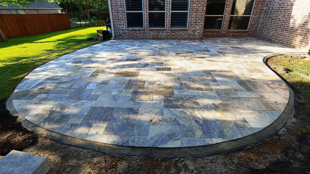
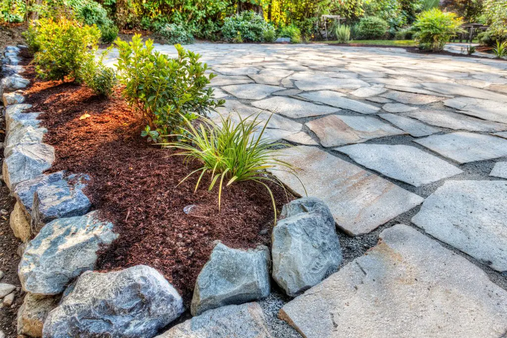
One of the standout trends in 2025 is the rise of large format natural stone pavers. Bigger slabs, such as 24″x36″ or even larger, are being used to create a clean, modern aesthetic with fewer grout lines. These oversized stones give outdoor spaces a sleek, expansive look, ideal for contemporary patios and pool decks.
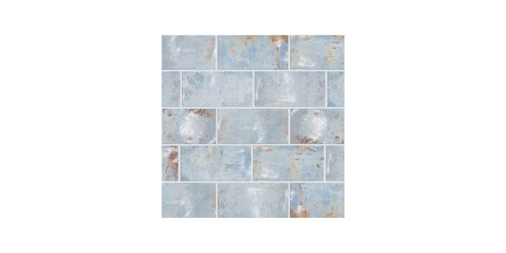
2. Textured and Tumbled Finishes
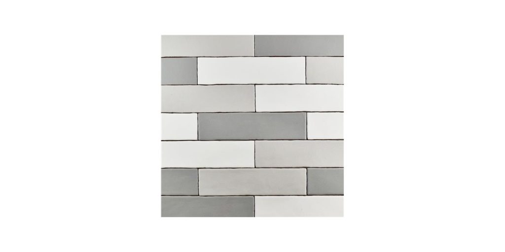
While polished finishes have their place, textured surfaces are gaining popularity this year. Homeowners are leaning into tumbled, brushed, or flamed finishes that provide a more natural, aged appearance. These finishes not only look beautiful but also add slip resistance, making them perfect for wet areas like pool surrounds or walkways.
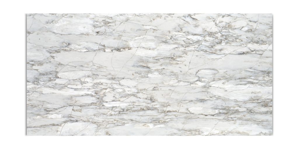
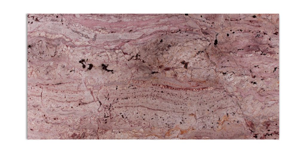
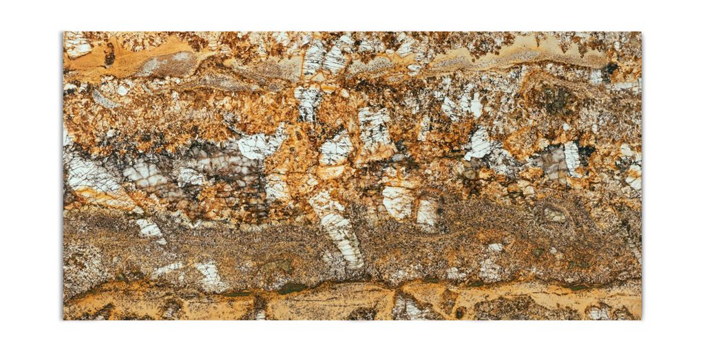
3. Neutral Earth Tones
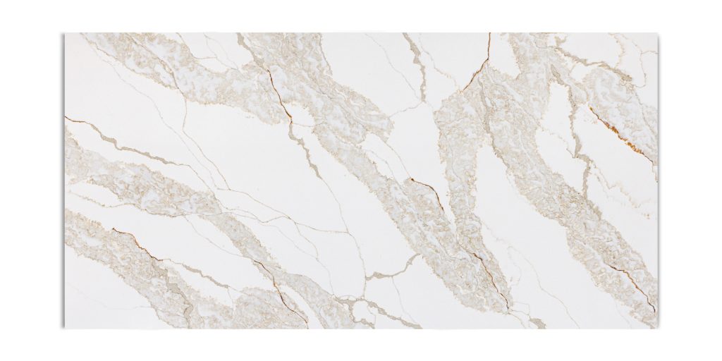
In 2025, the color palette for natural stone pavers leans heavily toward soft, earthy tones. Think warm beiges, soft grays, sandy browns, and creamy whites. These colors create a calming, organic look that complements both modern and rustic outdoor designs. Stones like limestone, travertine, and light-colored sandstone are particularly popular for this trend.
4. Sustainable and Local Sourcing
With growing awareness of environmental impact, more customers are seeking sustainably sourced natural stone. In 2025, there’s an emphasis on using locally quarried stone whenever possible to reduce transportation emissions and support regional businesses. This trend highlights not just beauty, but responsibility in outdoor design.
5. Mixed Stone Patterns
Designers are getting more creative with layouts, using a mix of stone sizes and patterns to create visually dynamic surfaces. From random ashlar to Versailles patterns, combining different shapes and sizes of the same stone adds texture and interest without sacrificing harmony. This trend brings personality to patios, driveways, and garden paths.
6. Seamless Indoor-Outdoor Transitions
Blurring the line between indoor and outdoor living continues to be a major design goal. In 2025, homeowners are using the same or similar natural stone materials in both their interiors and outdoor spaces to create a cohesive flow. Matching kitchen floors to outdoor patios, for example, helps extend the living space and bring nature inside.
7. Low-Maintenance Appeal
Natural stone remains popular not just for its beauty, but for its longevity and ease of maintenance. In 2025, homeowners are increasingly drawn to pavers that require minimal upkeep yet maintain their aesthetic year after year. Durable options like granite, slate, and certain types of sandstone lead the way in this category.
Final Thoughts – What is the trend in pavers 2025?
The natural stone paver trends of 2025 blend timeless materials with modern style and sustainability. Whether it’s through large formats, earthy tones, or eco-conscious choices, the direction is clear: homeowners want outdoor spaces that are not only beautiful, but enduring and thoughtful.
If you’re considering updating your outdoor space, now is the perfect time to explore our wide selection of natural stone pavers. Let the trends of 2025 guide your design—and enjoy a space that will stay stylish for years to come.